Katie Bohlke
  • Work
  • Resume
  • About Me
  • Contact

Johnson Brothers Logo Concept

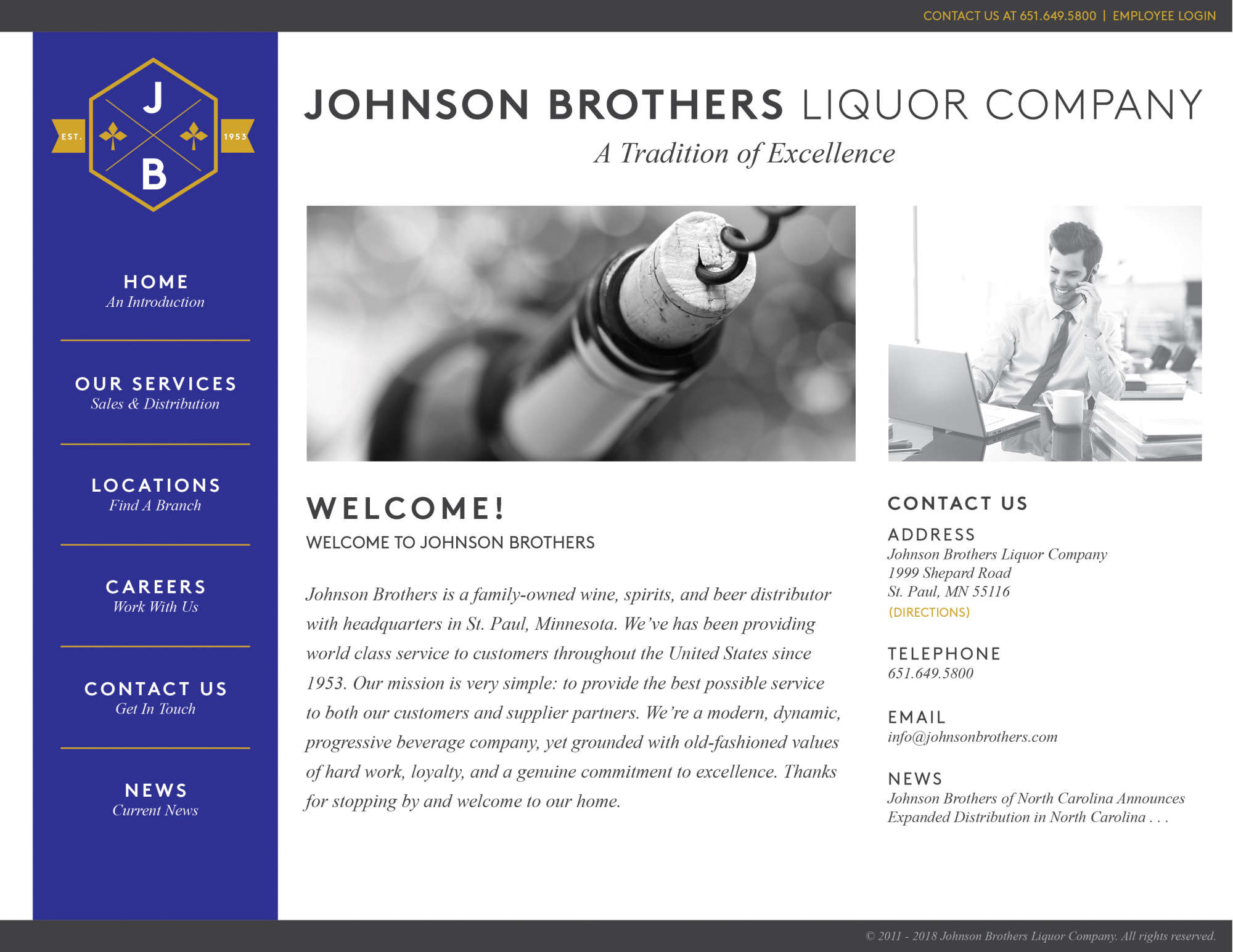
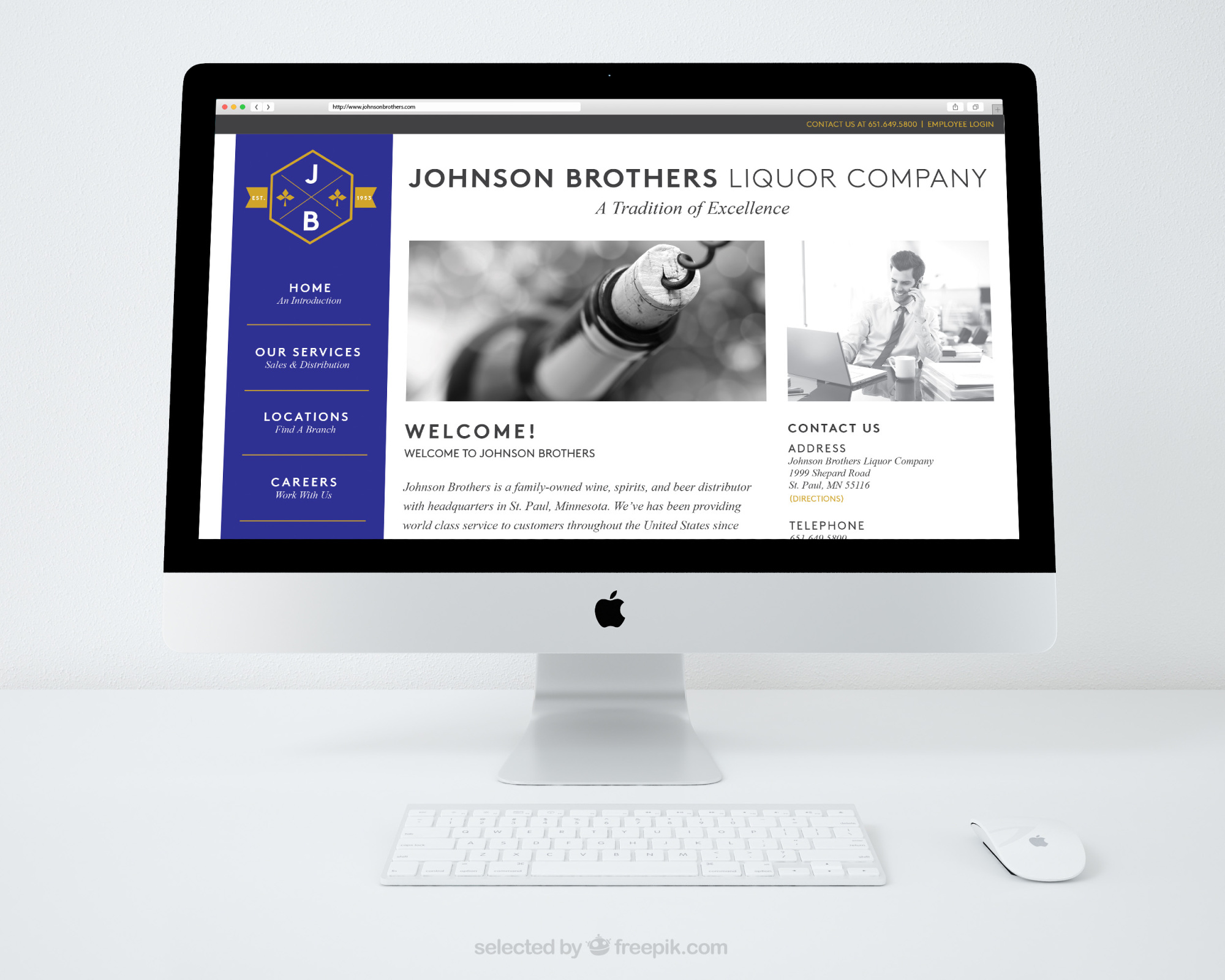
While working at Johnson Brothers Liquor Company, our graphics department was given the task of conceptualizing the re-designing of the current Johnson Brothers' logo. It was requested that we make the logo more modern and clean while still maintaining the general image of a crest, along with the horse and clover silhouettes. I had fun playing around with both the traditional crest shape as well as an unconventional crest shape to create two eye-catching versions of our current logo, with a splash of a gold tone to compliment the dark blue. I then make a mock-up of what our website could also be designed as to reflect the lighter and more modern tone of my new logo concept.

Date:

February 2018

Client:

Johnson Brothers Liquor Company

Role:

Art Director/Graphic Designer
Pizza Lucé

Pizza Lucé "Back To The Block" Block Party

Dark Horse Baseball Flyer

Dark Horse Baseball Flyer

Matt Wandzel Realtor Rebrand

Matt Wandzel Realtor Rebrand

Tropic Mayhem Beer Collab Branding

Tropic Mayhem Beer Collab Branding

Lucé's Big Adventure Beer Collab Branding

Lucé's Big Adventure Beer Collab Branding

"Streamline" Type Specimen

Pizza Personalities

Pizza Personalities

Menu Designs

Menu Designs

Whiskey Neon Sign

Whiskey Neon Sign

Illustrated Letters

Illustrated Letters

"Daisy" Drawing

"The Count of Monte Cristo" Book Series

© 2025