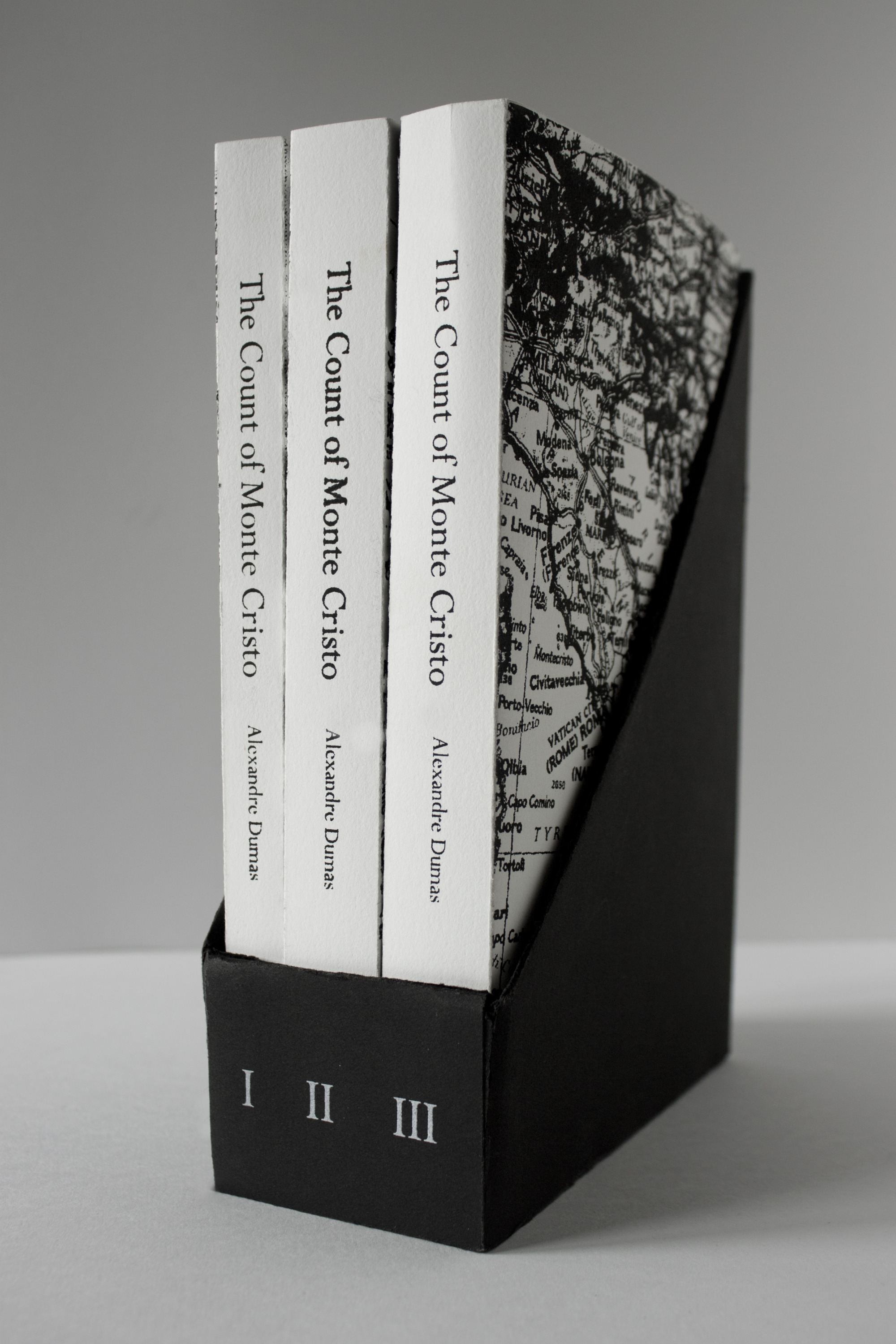
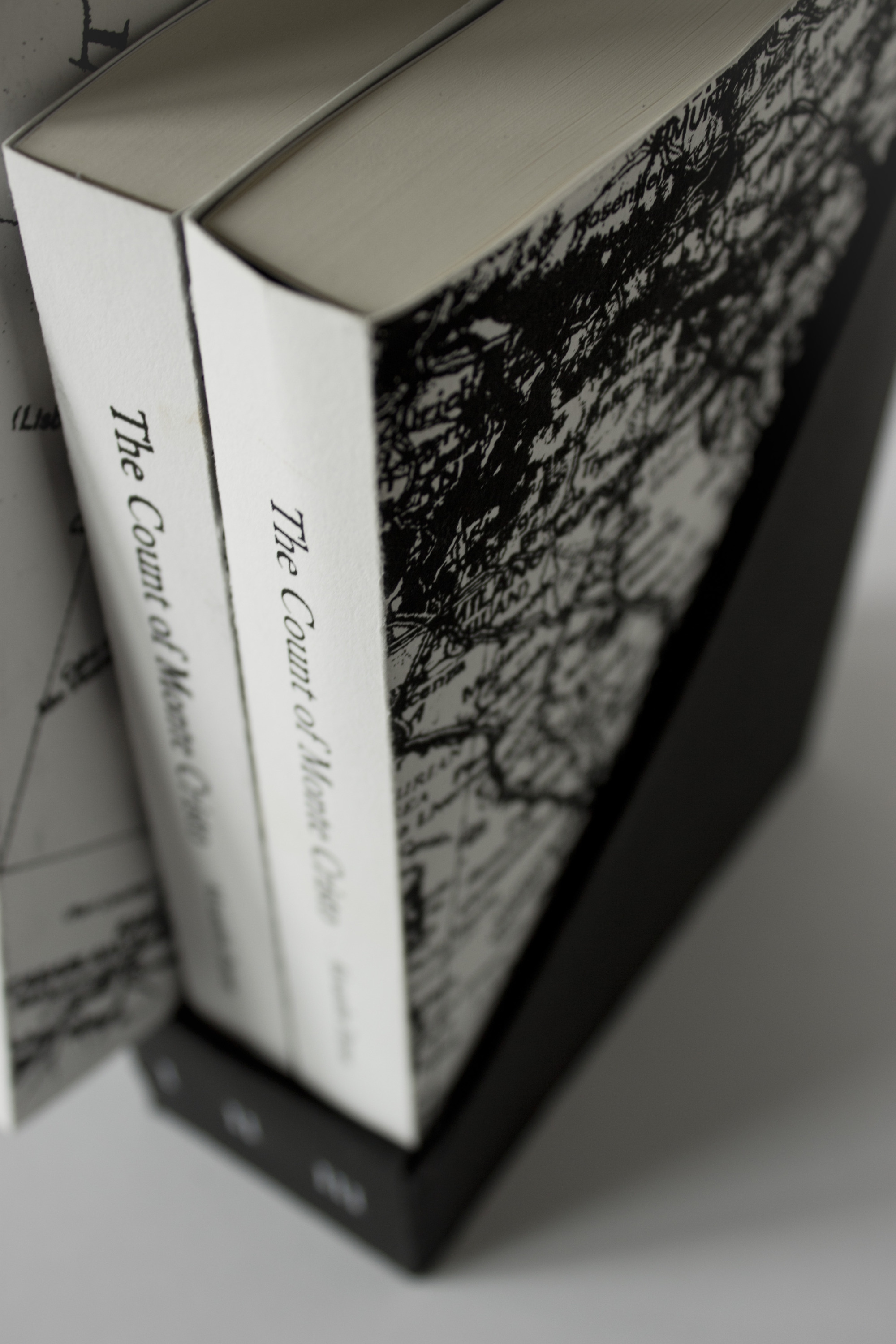
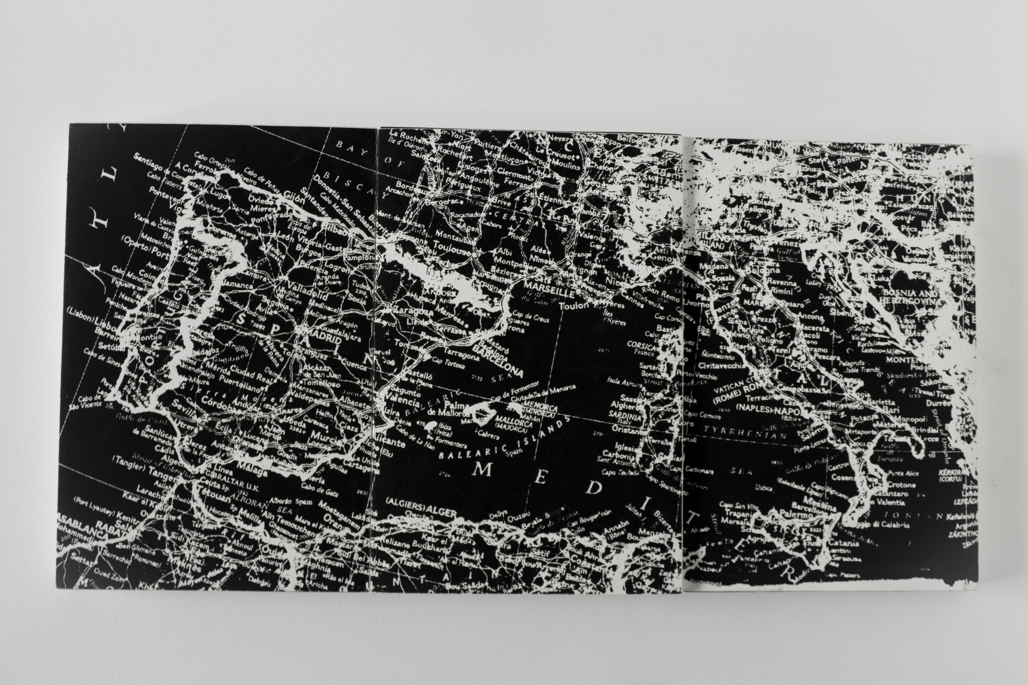
During my Typographic Design class, we had to choose a classic novel for redesigning the cover and resetting the typography inside. I chose the classic historical fiction, The Count of Monte Cristo, written by French novelist and playwright Alexandre Dumas. Since this story is so long, I decided to break it into three separate books during it's most climatic moments. In all, this is a riveting, romantic tale of revenge by a man who believe he acts as the agent of Providence. The story has adventure, intrigue and romance while also presenting a vivid portrait of France from the end of the Napoleonic years to the early 1840's. I designed the covers of the three books as a map because the protagonist is always traveling from one spot to another (since he was a sailor) along the coast of Spain to France to Italy as the tale unravels. The most interesting thing about the book cover design is that both the front and back of each book has a design; the front is the map with a white background and black writing while back is black with white writing. This is because the beginning of the story starts on a more positive note with good intentions from the protagonist until he starts to plan his revenge, which is when things become dark and dangerous.
Each book is set in a classic typographic style following a strict grid system. The typography is all set in Perpetua in varying font sizes and weights. To match the aesthetic of the book design, I created a holder to keep the series of books contained so it feels like one large book. On the back of this holder I set a description of the story, which is usually found on the inside flap of a book cover; putting the description on the back of the holder helps create a unified feel for the series of books. Everything on the covers and holder of the books is screenprinted by myself and the books themselves were printed at blurb.com